8 February 2011
28 January 2011
Old Master Cheese

When asked what kind of cheese he would like, my son Sweeney (two years old) stipulates "Old cheese. Like a grown-up". This must be what he means: Old Master cheese.
Posted by
Crritic!
at
7:29 am
0
comments
![]()
Labels: advertising, art, graphic design
31 October 2009
Design for Obama

It was an experiment in linking grassroots activism with the political machine using new technology, and it is being studied by wonks around the world.
Hundreds of artists and designers expressed support for the Obama candidacy by designing posters and submitting them to designforobama.org for free download. Many of these were actually taken up by the campaign, and others just travelled the superhighway as viral emails, making their point on their own.
Taschen is publishing Design for Obama. Posters for Change: A Grassroots Anthology This selection of the best, curated by Spike Lee and Aaron Perry-Zucker, is a visual document of this most inspirational U.S. presidential campaign.
Posted by
Crritic!
at
2:59 pm
0
comments
![]()
Labels: books, graphic design, politics
18 July 2008
Fashion and the art of motorcycle maintenance
I have never actually driven (as opposed to been driven on) a motorcycle. I imagine it's wonderful and exciting, but I'm frightened to death of... well, death. I like the idea of several inches of steel and glass around me as I hurtle down a highway at speeds likely to result in mutilation should I come suddenly into contact with a stationary object.
But this stuff is so damn sexy I would get on a cycle just to have an excuse to wear it.
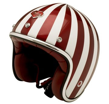

An outfit from France called Les Ateliers Ruby make these vintage-style helmets that are things of beauty. Their website is also a thing of beauty.
Thinking that there couldn't possibly be a retailer in my country I was surprised to find that there is in fact a stockist in Sydney, Deus Ex Machina, who fill in the rest of the picture; the kinds of jackets, T-shirts and indeed motorcycles that provide an excuse to be seen in the street wearing a gorgeous helmut without frightening small children.


![]()

Posted by
Crritic!
at
5:01 pm
0
comments
![]()
Labels: design, graphic design
15 July 2008
Great Ideas, great design
I have mentioned Penguin's release of the Penguin 70s before. I had a vague feeling that they were connected with the very differently wonderful 'Great Ideas' series as part of some festival of republishing Penguin were indulging in.
The Penguin 70s were commissioned from many different designers, reflecting the eclectic nature of their unmatched back catalogue. While the Great Ideas are extremely diverse in style, I never knew the whole series originated with the same company, David Pearson Design.
Thanks to Daniel at Nevolution, I've been introduced to David Pearson's website which is itself a paragon of elegance, economy and simplicity, exactly the values the best Penguin book designs embody.
The first surprise for me was that there are two more 'Great Ideas' series (Blue and Green)...


...but there are also German-only editions with beautiful covers. 

There is also a stunning series of 'Great Loves' editions, which are breathtaking. For an idea that could have been so corny, the result justifies the entire rerelease project. I want to see them and hold them in my hand, but most importantly, I want to read them.


I agree with Daniel, Tschichold and Lane would indeed be proud.
Posted by
Crritic!
at
2:53 pm
0
comments
![]()
Labels: books, graphic design
24 April 2008
Orange Crate Art
In honour of Michael Leddy and his blog Orange Crate Art, here is a selection of real, honest-to-goodness orange crate art.
These are my favourites. Enjoy:


I found these at the amazing BoxOfApples.com.
The site contains this helpful description:
BoxOfApples.com is the online museum (and gift shop) of fruit crate labels from the early 1900s to 1950s. Back in the days of our grandparents and their parents, people did their produce-shopping at markets that were more like a farmer’s market than today’s grocery stores. The fruit and vegetables would be displayed in their shipping crates somewhere near the railroad tracks, probably under a big shed. Each crate would have a label (up to a foot square) showing the name of the packer, and a colorful design to differentiate the brand. Fruit crates disappeared with the advent of self-service supermarkets and cardboard boxes, but thousands of vintage labels have survived in mint condition, rescued from warehouses and print shops, mostly on the West Coast. Beautifully printed by stone lithography with eight- or twelve-color inks, they are now collectors' items with a big following on eBay. On this site you can see dozens of different designs, and buy large-format, high-quality reproductions for home or office.
It includes an article on the history of crate labels.
Posted by
Crritic!
at
4:17 pm
0
comments
![]()
Labels: art, graphic design
30 May 2007
The font that ate a planet
It might have skipped your notice, or not, but this year is the anniversary of a typeface. The typeface, actually. It is fifty years since the birth of Helvetica.
Designed by Max Miedinger in 1957, it has become easily the most ubiquitous form of type of any kind in the world. Originally it was called 'Neue Haas Grotesk', but the name was thought to be too foreign and cumbersome by the parent company, the Haas type foundry, and was changed to the latin name for Switzerland in 1960.
There's an exhibition at the Museum of Modern Art. There's a nice slide article from Slate, demonstrating its world wide ubiquity, and now, there is a film.
I'm told that the movie features many of the living legends of graphic design all expanding on why they hate it so much. Can't wait.
This is the official film poster:
But I much prefer David Carson's characteristic attempt:
Posted by
Crritic!
at
4:35 pm
0
comments
![]()
Labels: film, graphic design
9 May 2007
Weird ads


Sorry to bring the tone down a bit, but here are some great weird ads.
See more at Weirdomatic.
Posted by
Crritic!
at
12:29 pm
2
comments
![]()
Labels: graphic design
28 March 2007
16 March 2007
Hot Dog!

I love this. Genuine ephemera. The lady looked puzzled when I asked for just the bag, thanks.
So what's going on here? I think our sausage is looking happy about something, possibly 'excited expectation'. My daughter thinks he looks frightened or apprehensive. I can't see it myself.
But what, in god's name, is he doing wearing skis? Is there some obscure refernce to 'hotdogging' I don't quite get?
The irony is that I was looking a bit sunburned at the time and was wearing shades and a fetching panama hat. It was not winter. In fact, I don't think Port Fairy has seen snow since the last Ice Age. He's definitely not from these parts.
Posted by
Crritic!
at
5:00 pm
4
comments
![]()
Labels: found things, graphic design
12 June 2006
Weird dirty book covers
Exactly what it sounds like. Weird illustrated covers of 'dirty books' from Italy in the Seventies. Like all good kitsch, they amplify the predjudices and unconscious shadow-thoughts of us all.
This is undoubtedly my favourite. I'm not not sure what that says about me, and I'm not sure I want to know.
The links are fun, too.
Posted by
Crritic!
at
10:37 am
1 comments
![]()
Labels: graphic design
16 May 2006
Celebrity Buttocks
Beware the perils of the badly placed masthead.
Get your copy of "Buttock" magazine at all good news stands!
This was spotted by blogger Nick Fruhling.
Posted by
Crritic!
at
12:21 pm
2
comments
![]()
Labels: graphic design
21 April 2006
Industry Group CEO takes Smylex!
The Australian Industry Group are advertising an address to the National Press Club by Heather Ridout, CEO. Presumably she will not appear dressed as the Joker from ‘Batman’ who she strongly resembles.
Seriously, is Heather’s smile so wan and unconvincing that she needed such help from Adobe Photoshop? Did they think we wouldn’t notice? Check out the distance between the edges of her ‘smile’ with the placement of her teeth.
The Joker: New and improved Joker products! With a new secret ingredient: Smylex!
Posted by
Crritic!
at
12:31 pm
3
comments
![]()
Labels: graphic design
27 March 2006
Cow Whisperer
It's in the nature of my line of work that some pretty strange things come across the desk. This is one.
Now, am I off the mark to think there is something not exactly right about this? What is she doing with the cows? One appears to be lying on the girl or across the girl and she doesn't appear to be unhappy about it! Bovinophilia?
One wonders what the Minister thought about his commitment to launch the document when he got a look at the cover.
I haven't got a scanner handy so I can't show you the reverse side, but maybe a description will suffice. In a layout mirroring the front cover, a meatworker wearing a gauntlet and holding a large cleaver smiles for the camera as he slices through a particularly fine looking set of spare ribs.
Cow love.
Posted by
Crritic!
at
9:52 am
3
comments
![]()
Labels: graphic design
15 December 2005
Ms.-print
For most of my working life, I've been preparing material for print. It's a terrible feeling when you hold the finished, proofed and printed document in your hands and your eyes fall on a typo that was invisible five minutes ago, but now seems to have flourescent lights attached to it as it dances before your eyes, mocking you with every provocative jiggle.
Obviously the editors of Ms. magazine's May/June 1996 issue never had this feeling when they received the printed and bound copies for distribution. Neither did they have it as the copies sat on newsstands for two months. Then they got the feeling, and withdrew the item quietly from sale.
Can you see it?
Thanks to Panopticist.
Posted by
Crritic!
at
5:50 pm
2
comments
![]()
Labels: graphic design
Daily Type
For those, like me, who have a mysterious and abiding love for typography, this is worth a look. Good, bad, ugly or beautiful, it doesn't really matter - I like it all.
It's a creative project run by several Russian type designers. Day by day, they create original typefaces and post their results. This piece is by Yury Gordon.
Daily Type.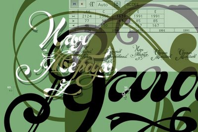
Posted by
Crritic!
at
12:10 pm
1 comments
![]()
Labels: graphic design, typography
8 December 2005
The Museum of Bad Album Covers
Every so often you come across something that neatly encapsulates everything that is good about the internet. Such a site is the Museum of Bad Album Covers.
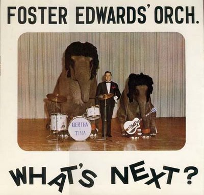
We’re not just talking Herb Albert and His Tijuana Brass bad, or even Village People bad. We’re talking high voltage, off the scale, river deep mountain high, turn the amp up to eleven bad. We’re talking stuff like this:

They got up that morning, had a shave and a shower, got dressed and looked at themselves in the mirror and thought "You know Sven, you are one bitchin' motherf***er!". Now, at what point was the mistake made? I'm not sure.
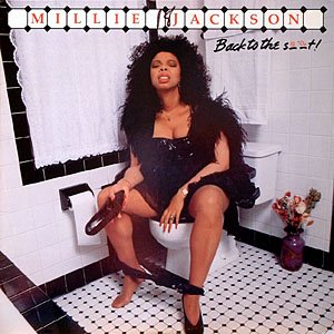
What's with the shoe? And why in God's name is it brown?

Is there a poo theme developing here? Is he going down or is he coming out?

Lordy. Where to begin? I'm not sure which is worse: what the woman's up to on the cover or the possibility that it's an album of ventriloquism. Note the clever pun: Dick and Willie - are you with me?

About as funny a police photo of a murder scene, which it strongly resembles.
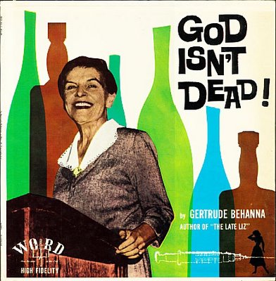
New from Nietszche records! (Is this an alcoholic hallucination?)
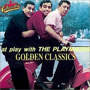
"What is happening to the poor man at the front daddy?"
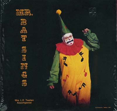
John Wayne Gacey's Greatest Hits.

"Not the foetus in the rubbish bin AGAIN?!" New on the Vatican Label.
The folks at Bad Album Covers invite votes on the top ten worst covers in their collection. The winner was a cover of such wrong-headed awfulness, such offensive stupidity, that I’m afraid I can’t bring myself to put it up here. Suffice to say that it is "Virgin Killer" by The Scorpions, for which someone at RCA records should have been sacked and quite possibly prosecuted. I’ll link to it here.
More at Show and Tell.
Posted by
Crritic!
at
12:22 pm
4
comments
![]()
Labels: graphic design, music


.jpg)


